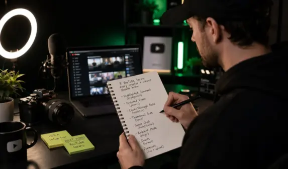
20+ Best Fonts for YouTube Thumbnails That Boost Your Clicks
In today’s YouTube landscape, grabbing attention isn’t just about flashy edits or viral titles, it starts with your thumbnail. And in 2026, one question creators are asking more than ever is: what’s the best font to make people click? When it comes to standing out, choosing the right YouTube thumbnail fonts is crucial—these fonts are designed to catch the eye and make your content pop in a crowded feed.
Whether you’re making prank videos, tech tutorials, or lifestyle vlogs, your thumbnail font plays a huge role in how viewers perceive your content. The right YouTube thumbnail font can stop the scroll, boost your click-through rate (CTR), and build a consistent visual identity for your channel.
If you’re serious about growing your channel, BuzzVoice is here to help. Grow your Youtube channel by buying high retention views, video likes and subscribers, BuzzVoice helps creators not only look professional but get seen.
Why Fonts Matter in YouTube Thumbnails
When someone scrolls through YouTube, you’ve got maybe a second or two, if you’re lucky ,to grab their attention. That’s why the font you choose in your YouTube video thumbnail isn’t just about aesthetics; it’s a strategic move.
The right font instantly communicates what kind of video you’re offering. Is it something fun? Educational? The typography sets the tone before the viewer even reads the title, and it also signals the style and quality of your video content, setting expectations for viewers.
YouTube Fonts also directly impact readability. If someone can’t make out your text at a glance, especially on mobile devices, they’ll skip right away, no matter how valuable your content is. That’s why it’s crucial to choose fonts that remain legible in various sizes, ensuring your message is clear on any device. And over time, consistently using the same font or style helps build your brand identity.
People start to recognize your videos by looking alone. Best of all? A clean, bold font can seriously increase your click-through rate. Because when your text is eye-catching and easy to read, people are simply more likely to click.
20+ Best Fonts for YouTube Thumbnails in 2026
Not every font fits every channel and that’s a good thing. In 2026, creators are leaning into fonts that reflect their niche and video style. For example, if your content revolves around challenges, reactions, or high-energy gaming, bold and clickable fonts are the way to go. It’s important to experiment with different fonts to find the best fit for your thumbnail design and ensure your thumbnails stand out.
Here are examples of 20+ of the best thumbnail fonts for YouTube thumbnails that grab attention, are easy to read, and help boost click-through rates. These fonts are ideal for titles, reactions, and dynamic visuals commonly used in thumbnails.
🔥 Bold & Attention-Grabbing Fonts
These fonts are perfect for big titles that need to pop.
- Impact – Classic, bold, and instantly readable. Great for reaction thumbnails.
- Anton – Extra bold and tall. Highly readable in small thumbnail sizes.
- Bebas Neue – Sleek and modern. Great for tech, lifestyle, or vlog channels.
- League Spartan– Clean with thick strokes. Perfect for bold messages.
- Oswald – A bold sans-serif font that’s great for both modern and retro looks.
- Luckiest Guy – Playful comic-style font, great for entertainment or prank content.
- Lilita One – Rounded and fun, yet still bold and readable.
- Montserrat Extra Bold – Geometric and clean. Works for many niche channels.
- Big Noodle Titling – Military-style font often used in gaming thumbnails.
- College (Varsity) – Sports-style font for action, challenges, or athletic content.
✨ Stylish & Aesthetic Fonts
These fonts add personality while staying readable.
- Poppins Semi-Bold – Soft yet professional. Ideal for how-to or educational content.
- Raleway Bold – Clean with elegance—great for beauty or lifestyle channels.
- Playfair Display – Serif font with class—use for drama, storytelling, or cinematic vibes.
- Fredoka One – Rounded and friendly—perfect for family or food channels.
- Amatic SC (Bold) – Hand-drawn look, great for crafts, DIY, or casual content.
- Pacifico – Script font, playful and laid-back. Use sparingly for flair.
🎮 Fonts for Gaming / Tech / Reaction Channels
These fonts work well with high-energy thumbnails.
- Bangers – Comic book-style font—super energetic.
- Exo 2 Bold – Techie and futuristic. Great for product reviews or tutorials.
- Russo One -Heavyweight with a square, digital look.
- Audiowide – Sci-fi style font often used in tech or robot-themed content.
- Minecraft Font (MineCrafter) – Niche but popular for Minecraft or pixel-style game thumbnails.
Fonts like Impact, Anton, and League Spartan are top choices because they retain their clarity well at small sizes and deliver instant legibility. Then there’s Burbank Big Condensed, the font made famous by MrBeast which screams action and makes any thumbnail feel like a must-click.
For content creators in more professional spaces, I think tech reviews, tutorials, productivity tips, and clean fonts are king. Montserrat, Bebas Neue, Oswald, and Roboto Condensed all have sleek lines and modern touches that make your thumbnails feel organized and authoritative.
On the flip side, lifestyle vloggers, DIYers, and family-friendly channels often benefit from fonts with personality. Playful styles like Fredoka, Luckiest Guy, Comic Neue, or even Raleway Dots add charm and approachability.
Tips for Using Fonts in YouTube Thumbnails
First, size matters. Make sure your text is big and bold enough to stay easily readable even on small screens. Customize your font choices by adjusting size, color, and effects to create eye-catching thumbnails that grab viewers’ attention.
Adding contrast through outlines, shadows, or color blocks helps your text stand out against busier backgrounds, especially when you’re working with bright colors or complex imagery. Using cool fonts and fun font styles can make your thumbnails stand out even more, helping your video thumbnails attract more clicks.
It’s also wise to limit the number of font styles you use. Sticking with one or two keeps clean lines and helps reinforce your branding. Think about your channel’s tone too: a comedy channel and a history documentary series shouldn’t be using the same typography.
Developing a unique style is key to making your content recognizable. Experiment with different cool fonts and versatile font options to find what works best for your brand. Creating thumbnails with a unique style helps your thumbnails stand out and makes your channel more memorable.
Using a default font for your channel can help maintain consistent branding across your YouTube banners, video thumbnails, and how-to videos. Fonts with geometric design and crisp lines contribute to a modern, professional look that appeals to viewers.
Finally, if you want to know if it’s an eye-catching thumbnail, test it. YouTube now lets you A/B test thumbnails, so try experimenting with different eye-catching fonts and colorful backgrounds, and see what boosts your click-through rate.
When creating thumbnails for how-to videos, YouTube video thumbnails, and YouTube banners, customizing your approach can help your thumbnails stand out in a crowded feed. A great font choice is essential for achieving the perfect YouTube thumbnail. Using a versatile font can help your thumbnails stand out in video thumbnails and make your content more appealing and clickable.
Do you want to capture attention and have a strong presence on YouTube? Check BuzzVoice services for more views, likes, and subscribers.
Adjusting Font Size for Different Devices
Font size can make or break your YouTube thumbnail’s effectiveness, especially since most viewers are scrolling on their phones. If your thumbnail text is too small, it’ll get lost on mobile screens; too large, and it might crowd out your image. The sweet spot for thumbnail text is usually at least 75 pixels, but always test your design at smaller sizes to make sure it stays readable.
When designing your thumbnails, preview how your font looks on different devices—desktop, tablet, and especially mobile. Tools like Figma or Adobe Creative Cloud let you adjust and test font size across various screen sizes, so you can be confident your message is clear no matter where viewers find your video.
Prioritize bold, readable fonts and keep your text short to maximize impact. With the right font size, your thumbnails will stand out and draw in viewers, whether they’re watching on a big screen or a smartphone.
Related: How much does YouTube pay for 1 million views
Free Tools to Create Thumbnails With Great Fonts
You don’t need a graphic design degree to make scroll-stopping thumbnails. As a content creator, tools like Canva empower you to design effective thumbnails with drag-and-drop simplicity, tons of great fonts like Fredoka and Bebas Neue, and built-in font pairing suggestions that make it easy to get started.
For creators who want more control, Photoshop remains the industry standard. It lets you import any font, including custom or premium ones—such as River Drive, a bold typeface often used for travel or music channel thumbnails—and gives you access to advanced effects like gradients, masks, and layer blending for more complex designs.
If you want something lightweight and fast, tools like Fotor or Snappa are great options. They offer just enough customization for solid design without the learning curve of more advanced software.
Conclusion
Choosing the right font for your YouTube thumbnails in 2026 is more than just a design choice; it’s a growth strategy. Fonts are visual cues that tell your audience what to expect, and when chosen well, they dramatically improve CTR. Selecting the best YouTube fonts can significantly impact channel growth and viewer engagement by making your thumbnails more attention-grabbing and effective.
Whether you’re aiming for bold and clickable or sleek and professional, the best fonts are the readable ones, on-brand, and instantly recognizable. Keep testing, refining, and building a visual identity that sets your channel apart.
And when you’re ready to take things up a notch, BuzzVoice can help. From boosting engagement with views, subscribers, and comments, it supports creators who are serious about growth.
FAQ
What font does MrBeast use in thumbnails?
MrBeast often uses Burbank Big Condensed Bold, a custom font with bold, blocky letters that stand out even at small sizes. This font is designed for impact, its condensed width and thick strokes make it highly readable and visually powerful. If you’re aiming for a similar effect, look for bold, condensed display fonts that grab attention quickly.
Should I use the same font on every thumbnail?
Not necessarily, but maintaining a consistent font style or family helps build brand recognition. A strong approach is to use one primary font across your thumbnails, especially for titles while allowing flexibility with secondary fonts for variety.
How do I make my thumbnail text stand out?
Use bold fonts, high-contrast color combinations, and techniques like outlines or drop shadows to separate text from busy backgrounds. Also, keep your message short, around three to five words, and avoid overcrowding.
What’s the best font size for YouTube thumbnails?
There’s no fixed number, but your text should be readable at around 120×90 pixels, which is how thumbnails appear in mobile search results. Test your thumbnail at small scales before uploading. If the words become blurry or hard to read, increase the font size, simplify the message, or adjust the contrast between text and background.

BuzzVoice
BuzzVoice is the best place to go when you need instant engagement services on social media. Offering a wide variety of packages for Instagram, Youtube, Facebook, Twitter, Soundcloud & Tiktok.